Image Compression with Multipixels
 </img>
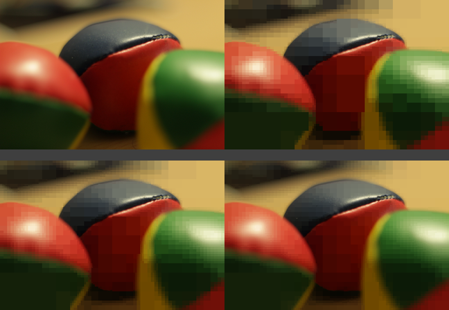
Figure 0. Original image, and different levels of compression with multipixels.
Digital images, depending on their quality, can take huge amounts of storage space and the number of imaging devices available just keeps increasing. Also, due to the limited transfer rates and their cost, reducing the number of bits to represent an image is an important issue. There are several compression algorithms that take advantage of statistical redundancy or the limited capabilities of the human eye, to encode the information using fewer bits. One such algorithm consists in creating pixels of different sizes for areas that have roughly the same color, thus reducing the number of pixels. In this post, I shall present an implementation of that algorithm, along with de- and en-coding algorithms for a proposed set of rules for storing such images as to reduce their storage footprint. All the code for encoding and decoding, as well as a nice visualization script are available on the Github repository for the project.
Introduction
Compression of data is the use mathematical tools that are capable of describing a given set of data by a set of mathematical rules that is smaller than the set of data. There are two kinds of compression: lossless and lossy. As their names indicate, the former refers to a method with which no data is lost in the process of compressing, while the latter refers to a process that approximates the original data well enough to say they are equivalent, although strictly speaking, information is lost during the process and cannot be recovered. Lossy compression is widely used for sound and image compression because a compressed and an uncompressed signal sensed by a human are virtually equal. Lossless compression plays a more important role when every bit of information has to be analysed or processed. Compression algorithms have been used for a wide variety of purposes, but mainly to reduce the storage space of files, or to boost the data transfer rates. Because most of the time these two factors, storage space and total data transfer can be translated into costs, there is a direct and measurable benefit provided by these algorithms.
There are several ways of compressing a set of data. One way is by approximating a function with a series of simpler terms such as trigonometric Fourier series, as is done with the JPEG algorithm. The image is treated as a function in 2 dimensions and then decomposed into a series of periodic functions with different frequencies and amplitudes. This can be done because every periodic function can be represented as the infinite sum of cosines and sines. Multilayer neural networks can also be used for such a purpose, for they provide a means of imitating an output given a specific input, and there is a number of learning algorithms such as back propagation which reduce the error between the desired and the actual output.
What these methods do is eliminate redundancy in the data set. One technique of doing so, without using approximation functions is called pattern substitution and consists of identifying redundant patterns in the data and substitute them by a reduced form or code.
Method
For 2 dimensional discrete signals like images, an example of a pattern substitution method is grouping together a set of adjacent pixels of roughly the same color, creating a multipixel that spans several single pixels in both directions, horizontal and vertical. To identify every multipixel in the image, they are tagged with 7 properties instead of the 3 components in colorspace a single pixel usually has. Those 7 properties are:
- Horizontal coordinate of the top-left corner
- Vertical coordinate of the top-left corner
- Width of the multipixel
- Height of the multipixel
- Red component of the multipixel’s color
- Green component of the multipixel’s color
- Blue component of the multipixel’s color
The proposed method creates candidate multipixels and calculates what the average color for that multipixel is. Then its variance is compared to a known threshold and if the variance is higher than the threshold, the multipixel is discarded and split into two new candidate multipixels that are analysed recursively. The process begins with the entire image being the first candidate multipixel, and runs until the multipixels are too small to be divided any further. This smallest size can be chosen as to reduce the total number of pixels. The variance of a multipixel is calculated as follows:
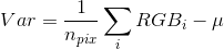
Equation 1.
Where μ is the mean RGB value in that multipixel.
The process of splitting the image alternates between horizontal and vertical divisions. If the image is wider than it is tall, the first division is vertical and the next division is horizontal. The alternation is inverted if the image is taller than it is wide. The sections need not be an even number of pixels long.
If the variance of the multipixel falls within the given threshold, the candidate multipixel is no longer split and can be stored.
Encoding and decoding
Before trying to encode a compressed image, it is necessary to establish a set of rules. The file has a header that is 16 bytes long. After the header comes the list of pixels which are a fixed number of bits long and after all the pixels a string of two bytes indicates the end of the file. The file then will be $NPix·BPP+18$ bytes long. The values $NPix$ and $BPP$, as well as the other 5 fields of information a multipixel needs are described as follows:
Number of pixels (NPix), for which we reserve 4 bytes, or a maximum pixel count of 4295 megapixels.
The number of bits per pixel (BPP), which is a variable value because depending on the size of the image we can have small images addressable with 8 bits, or really big ones that need, say, 12 bits. This value is calculated with the minimum number of bits that are needed to describe a pixel for a given image. The maximum size of the pixel will be as big as the image itself, so the minimum number of bits to describe a pixel’s size is  , where $W$ and $H$ are the image’s width and height, respectively. Then we need to express the pixel’s coordinates, which describe the position of the upper-left corner of the multipixel. Since the multipixel can be as small as one single pixel, the coordinates will have the same range as the pixel’s size, which means it will need the same number of bits, thus the total number of bits per pixel will be:
 </img>
Equation 2.
Then we have the size of the image in width and height, and for each of which 16 bits are assigned, making for a maximum image size of 65536 x 65536 pixels.
To add a little more information about what the file is, the first 2 bytes of the header are set to an arbitrary value that identifies the format, and they can be checked by the decoder when first opening the file and avoid reading through the entire file at once. Additionally an ending string can be set for the header, indicating the start of the image.
Then we can start with the pixels’ information. Because the pixels cannot be sorted according to their position as normal pixels are, they are stored as they are generated during the compression process, so both its horizontal (PosX) and vertical (PosY) coordinates have to be specified. The next two values have the same size because a single pixel can be as big as the image, so the width (WPix) and height (HPix) of each pixel are specified too. The last 24 bits from equation 2 are for the 3-component vector in RGB colorspace with one byte for each of its elements as is usually done on other formats.
After all pixels have been written, it is convenient to have an ending string in case the data has to be restored from an unknown filesystem.
Thus, the proposed storing rules would look like this:
\0x20\0xB2IMG[Width][Height][BPP][NPix]\0xBEn0x70[PosX][PosY][WPix][HPix][R][G][B]......[WPix][R][G][B]\0xBE\0x71Results
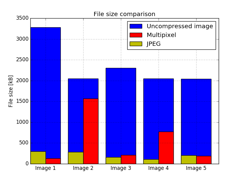
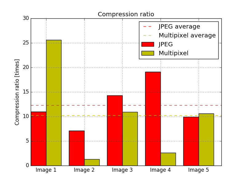
After running the algorithm against a set of 5 different images, which can be seen in the PDF version of the paper at the and of the post, the efficiency of the algorithm was measured. The source images were already compressed with the JPEG algorithm, so the size of an uncompressed image was estimated using the size of the image, supposing that every pixel occupies 3 bytes; so the file size would be 3·W·H bytes, where W is the width of the image and H is its height. As one would expect, the multipixel algorithm performs well when compressing images with very flat colors and not too many details. Both algorithms performed worst for the same image, and the multipixel algorithm performed the best for an image with very flat colors. The second worst image for the multipixel algorithm shows a very grainy region, which requires many different small pixels. The file sizes of the output images are shown in Fig. 1. Both algorithms show a very high compression ratio for the tested images, as can be seen in Fig. 2, averaging a 12.31 fold reduction in size for JPEG, and 10.23 for the multipixel algorithm, with a maximum of 25.6 fold and 19.1 and a minimum of 1.3 and 7.1 fold for the multipixel algorithm and JPEG, respectively.
 </img>
Figure 1.
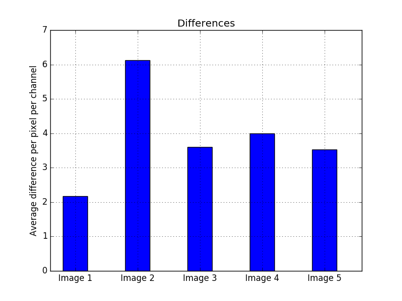
It is also important to measure the quality of the compressed images, and not only the compression ratios, because an image can be compressed with an extremely high ratio but a terrible quality so the two images have no resemblance anymore. The way of comparing the quality, is to measure the differences between the two images and adding them all together along the three channels and then normalizing it by dividing by the total number of pixels times three. In order to have a sense of scale, the compression quality between two completely different images was measured and the result was an average of 80 per pixel per channel, while a perfect image will have a difference of 0 per pixel per channel. In Fig. 3 the quality of every compressed image is shown, and the result is consistent with the other two plots, where the image with the least quality is also the image with the least compression ratio.
 </img>
Figure 2.
Conclusion
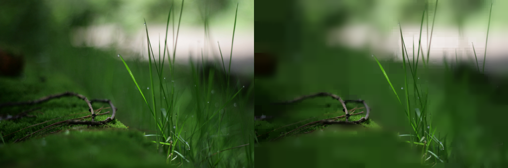
The presented algorithm shows it can compress images at a high ratio if given the correct circumstances, i.e. relatively big areas with flat colors. Nevertheless, the resulting images have a rough texture due to the nature of the algorithm. A way to correct that, would be to blur the areas where the biggest pixels are, as shown in Fig. 4 where the image was blurred selectively, making it have a high resemblance with the original. Nonetheless, the quality of both images was compared with the method described in the previous section, and the quality of the blurred image is slightly lower compared to the multipixel image, although does not seem to be statistically significant.
 </img>
Figure 3.
The format used to store the compressed images reserves more bits than are commonly used for the size and coordinates of the pixels because very few times there are multipixels as big as the image. This results in 4 fields for every pixel that, for small pixels, have several unused bits, that is to say they are set to zero. This allows for further compression using statistical methods.
 </img>
Figure 4. Selective blurring.
Alberto Barquin is a master’s student of Space Science. He’s from Mexico City, and lives in Europe. He’s a self-taught programmer, and computer-vision enthusiast. To know more about him, check out his website. You can also find this article in PDF form.
Also, check out the repository of the project on Github. The code is easy to follow, and there’s a great visualization tool to see how the compression happens live.